
The following post was submitted by Color 2015 sponsor, GTI Graphic Technology, Inc.
What do a photographer, commercial printer, and sign printer have in common? They all have a need to accurately communicate color. When they carry out this objective consistently and accurately, they are providing a high level of value to their clients and increasing the efficiency of their business.
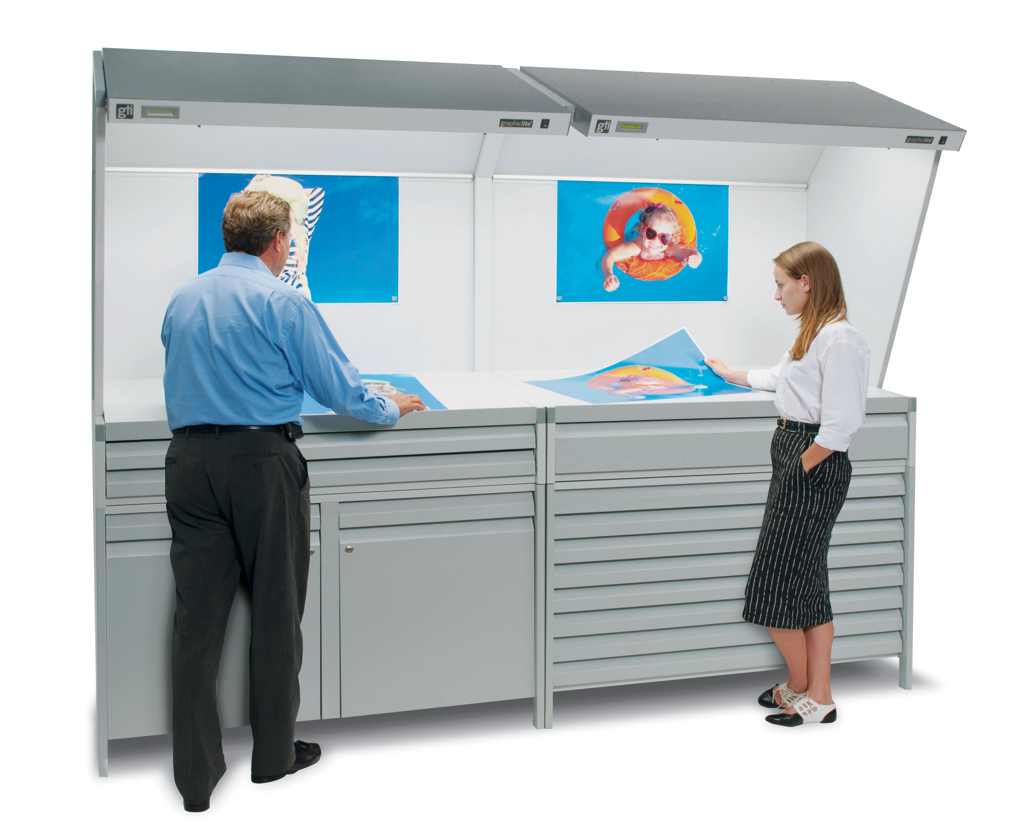
Obviously, accurately reproducing color is a complicated process. Especially when different substrates, technologies, and production facilities are involved. To help ensure that accuracy is achieved, two guidelines should be followed. The first is to view original artwork under several different lighting conditions and to pay particular attention to the “final use” lighting environment—if it can be defined. Once a color image has been approved as the target color, future viewing comparisons (between proof and corrected proof or press sheet) should be made under ISO standard D50 light quality. So, if you are producing a point-of-purchase sign for a store window, you should proof your color selection in a lighting booth that can accurately simulate daylight during production.
The second is to follow established industry standards. ISO 3664:2009 is the international color viewing standard for the graphic technology and photography industries and outlines targets and tolerances necessary for all color viewing systems to meet. All of GTI Graphic Technology’s Graphiclite® Color viewing systems meet or exceed the ISO:2009 Standard. GTI achieves this by utilizing lamps that provide the closest match to the spectral power curve of the industry aim point of D50, incorporating proper geometry of illumination into our booth designs, and by utilizing Munsell N8/ Neutral Gray to create the neutral surround conditions specified by the ISO:2009 standard.
A “neutral” gray, like Munsell N8/, is not a black and white mix, but an equal mixture of all the spectrum (r-o-y-g-b-i-v) colors. A spectrophotometric measurement of such a gray will show it to contain approximately equal amounts of those spectrum colors. Non-neutral grays, however, have unequal amounts of the spectrum colors, causing a cold or warm color shift under differing lighting conditions.
Neutral gray is specified and recommended for color viewing because it eliminates “simultaneous color contrast.” For example, a red sample viewed on a blue background has an orange cast, while the same red viewed on a yellow background appears slightly purple. For the eye to see color accurately, it is imperative that the surround environment be chromatically neutral. Neutral gray also minimizes “color pollution” of a viewing area, which is caused by reflections from chromatic surfaces.
When D50 standard illumination is reflected from colored walls, its color quality changes so it is no longer “standard.” The application of a neutral gray to chromatic surfaces will eliminate such color pollution by providing spectrally neutral surfaces around the viewing area.
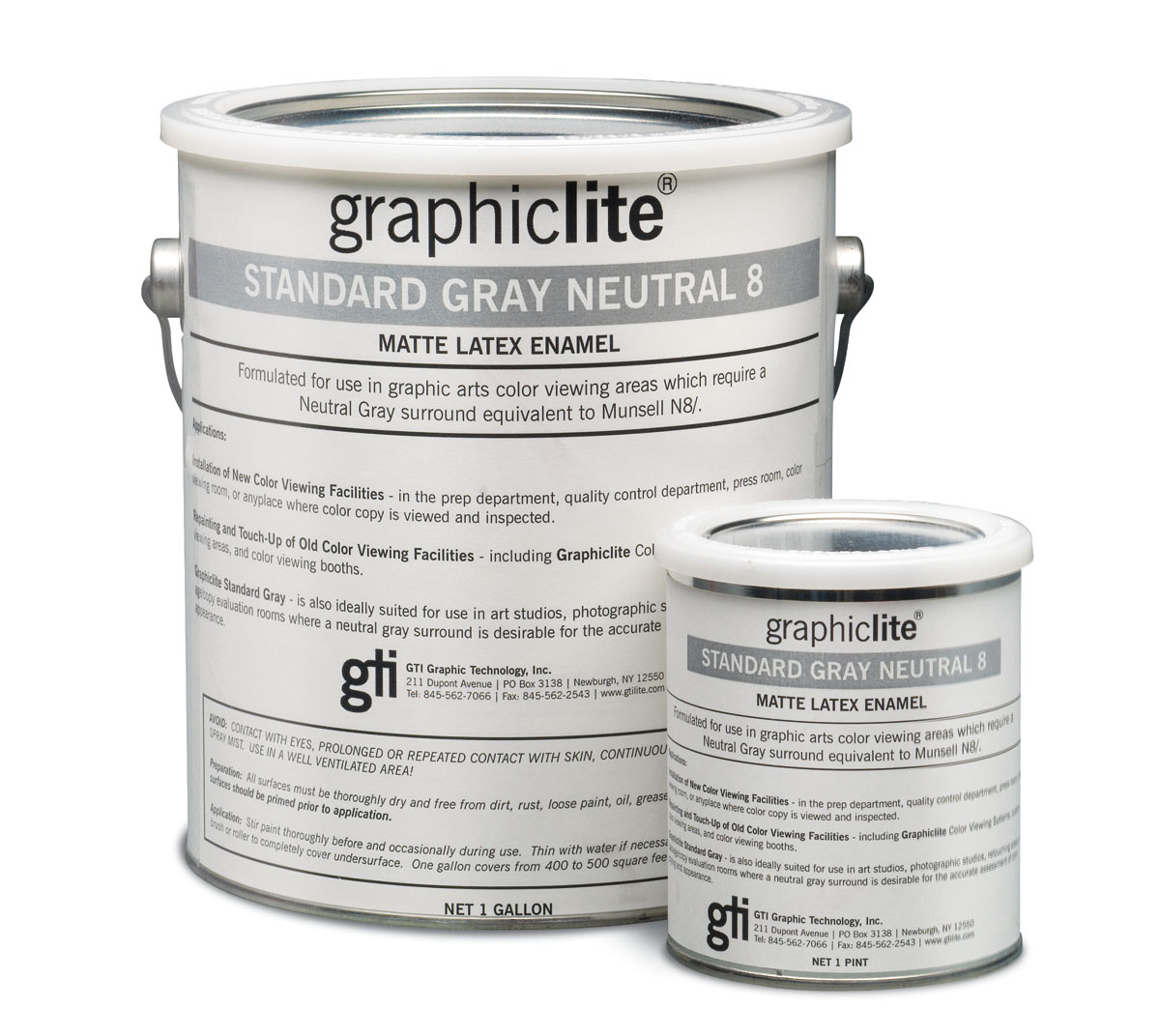
At GTI we not only paint all of our Color Viewing Systems for the graphic arts to the Munsell N8/ Neutral Gray Standard, we also offer Graphiclite Standard Gray Neutral 8 matte vinyl latex paint in gallon and pint size cans. GTI Graphiclite paint is the equivalent to Munsell N8/ and is used to paint walls, ceilings, floors, and other surfaces which are in the field of view. Painting these surfaces will reduce reflectance to 60% or less, the equivalent to Munsell N8/.
Industrial Color Matching
Industrial applications, which include plastics, textiles, paints, and other non-graphics related industries, use a Munsell N7/ Neutral Gray which is a slightly darker tone than Neutral 8.